CRS score draws project
[From Scrapping to Automation to Visualization w/ Google Sheet & Tableau]
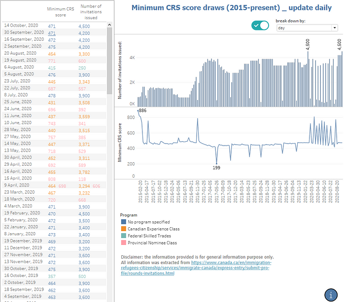
I was today years old that I discovered even with a free Tableau Public account, it is still possible to make dashboard update automatically while connected to a live data source. I was so excited because with abundant space left for my future google sheet collection (4GB), the possibilities are endless.
One day while calculating my CRS score from the CIC website, I found it quite difficult to have a quick overview of the historical data because it’s all text. Searching google images only give us a snapshot at a certain point of time. With the bump in search term trending for key word like “CRS scores”, I was pretty sure many people, especially new comers like me can benefit from a more concise dashboard. Hey, this could be an idea for my future project! And it was.
Data collection
I recall having done my first web scrapping project a while ago using BeautifulSoup, a Python library to collect stock market data from Yahoo finance website, collect data from CIC website should not be too hard. The problem was that this time I have to save it to a live database, and with limited database knowledge, Google sheets seemed to be my best option. This really is not the ideal platform to store data but surely a cheap and easy to set up option compared to server, which need to be hosted and queried using SQL.
I was quite excited because Google sheets have already had a built-in function that makes scraping a website seamless using =IMPORTXML function. All I need to do was paste the website link and select the <p> tags which contain data I need.

=IMPORTXML("[<https://www.canada.ca/en/immigration-refugees-citizenship/services/immigrate-canada/express-entry/submit-profile/rounds-invitations/results-previous.html>](<https://www.canada.ca/en/immigration-refugees-citizenship/services/immigrate-canada/express-entry/submit-profile/rounds-invitations/results-previous.html>)",A1)One problem though, the output comes in quite messy and contains a lot of things I don’t need (like footnote and descriptions). Because the import function will populate data onto empty cells, so it is not possible to make any direct changes in this sheet like delete unwanted row/column. I also want this process to be automated as much as possible after the CIC website updates so I use App Script to convert data to a new sheet.
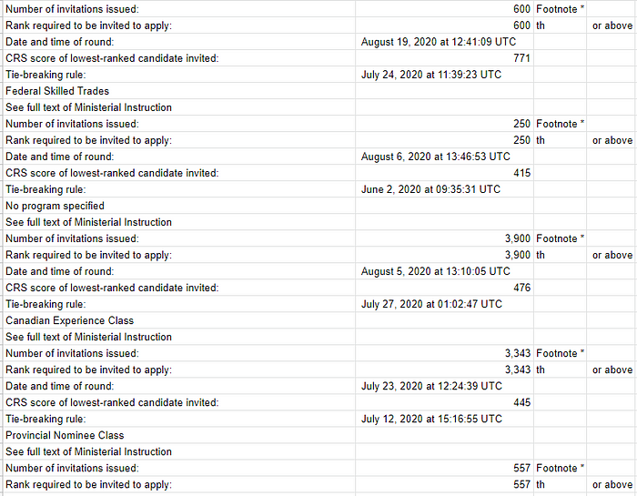
I noticed a pattern that the data I wanted almost always appear in order
Invitation issued → Date → CRS score → draw type (Provincial/Canadian Experience Class)
Using this rule, I just need to compare if the header string with “Number of invitations issued:”, then copy data point accordingly.
Initially I used
sheet2.getRange(j,1).setValue(sheet1.getRange(i,2).getValue());which takes a lot of time to iterate through the for loop, hence exceed the 6-minute script runtime limit, so either I have to perform in batch or chop the tasks in smaller chunk. I later learned that using array (batch approach) would be so much more efficient and way faster than set value to single cell.
People said cleaning data is a part of the job, and luckily I got my hand dirty in this project because of the inconsistency from the data source. The pattern changed after November 1, 2017 to provide more detailed data points, so I have to adjust my script to match the pattern from there.

May 30,2018 is an odd data point because there were 2 draws on the same date, and the crawler only gave 1 row. Luckily, I have stored 2 variables for date to double check and add another row to notice and adjust to this.
I ended up combining 3 sheets into 1 because of this inconsistency that only stored most valuable information (Invitation issued, Date, CRS score, draw type). Last step was what I look forward the most: let Google sheet run itself everyday, so the table will update on future draw by click on the trigger icon (right next to save).
This project was quite simple at a glance, however dragged me over a w̶e̶e̶k̶ month because of u̶n̶f̶o̶r̶e̶s̶e̶e̶n̶ ̶p̶r̶o̶b̶l̶e̶m̶s̶ procrastination, many of which involve debugging and rethinking my approach after trigger error (error during automation that was not detected when I ran script manually)

When I followed data scraping tutorials online, the data turn out nicely as the website was set up with unique format. However, many times, that is not the case, and we need to be ready for mistakes people made even though they did it unintentionally. Sometimes, it can be noticed just by looking at the head and tail, or the outliers of the dataset, so keep that in mind.
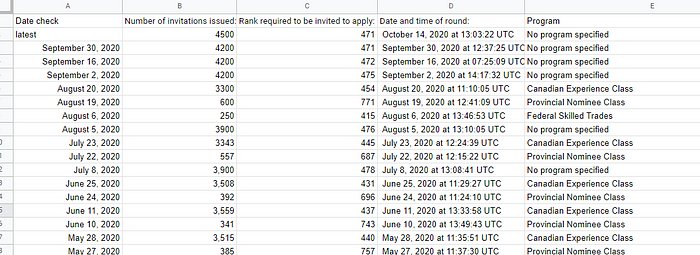
After some time doing janitor’s work, now we have a nice and crisp table that combine all CRS draws. It’s time to make some visualization and see how the trend has changed overtime.
Data visualization
Since I have been using Tableau for a while, it’s just a matter of drag and drop and make some adjustments to have a nice dashboard.

What I learned from this time around was that how to make a parameter to change the date level of data. This way, I can view the date by day, month, quarter or year to have different perspective on various levels of granularity.
Insights and wrap up
Using the visualization we can see a slight drop in number of invitation in 2019 (compared to 2018), which also has been slowly increasing since 2020. We also see the separate draws among different programs in 2020 instead of all aggregated like before. The data was more detailed after 2017 (which caused me trouble scrapping earlier), which explained why there are some weird peaks on the graph. Candidates selected from provincial or federal program has way more points than normal candidates, that’s why their scores are relatively much higher than others.
There are not many insights from the data of CRS score draws, however, it provides an overview how the trend has been for the past 4 years and being updated daily so I don’t have to to the job manually. Overall this was a fun project that I finished while learning a tons about Google App Script, a bit more about Tableau and have something nice to show in the end. Surprisingly the dashboard can be reused by embedding onto any website, so feel free to do so:
As a last piece of the project, I documented what’s new and keep all relevant resources that I used or found helpful while working. My apology if you found this messy and hard to follow up, I’m a bit lazy to write up every details. However, here are the main elements:
Update on Jan 2021: unfortunately I received error notice from my automated run that it no longer working. After checking the website, I realized that the format of data being shown has been changed (surprisingly this new change is much better to view and was what I wanted before the project). I might go back to maintain the script but now the data is much easier to be copy just by copy and paste directly, so I temporary turn off the script and let it visualize data until Dec 2020. I learned a ton from this experience and hope to have some other exciting project with Google App Script in the future, until then, stay tuned!
